Working on some Eustathios text to put on my printer and I figured I’d ask some opinions. Here are my current thoughts, in no real particular order.
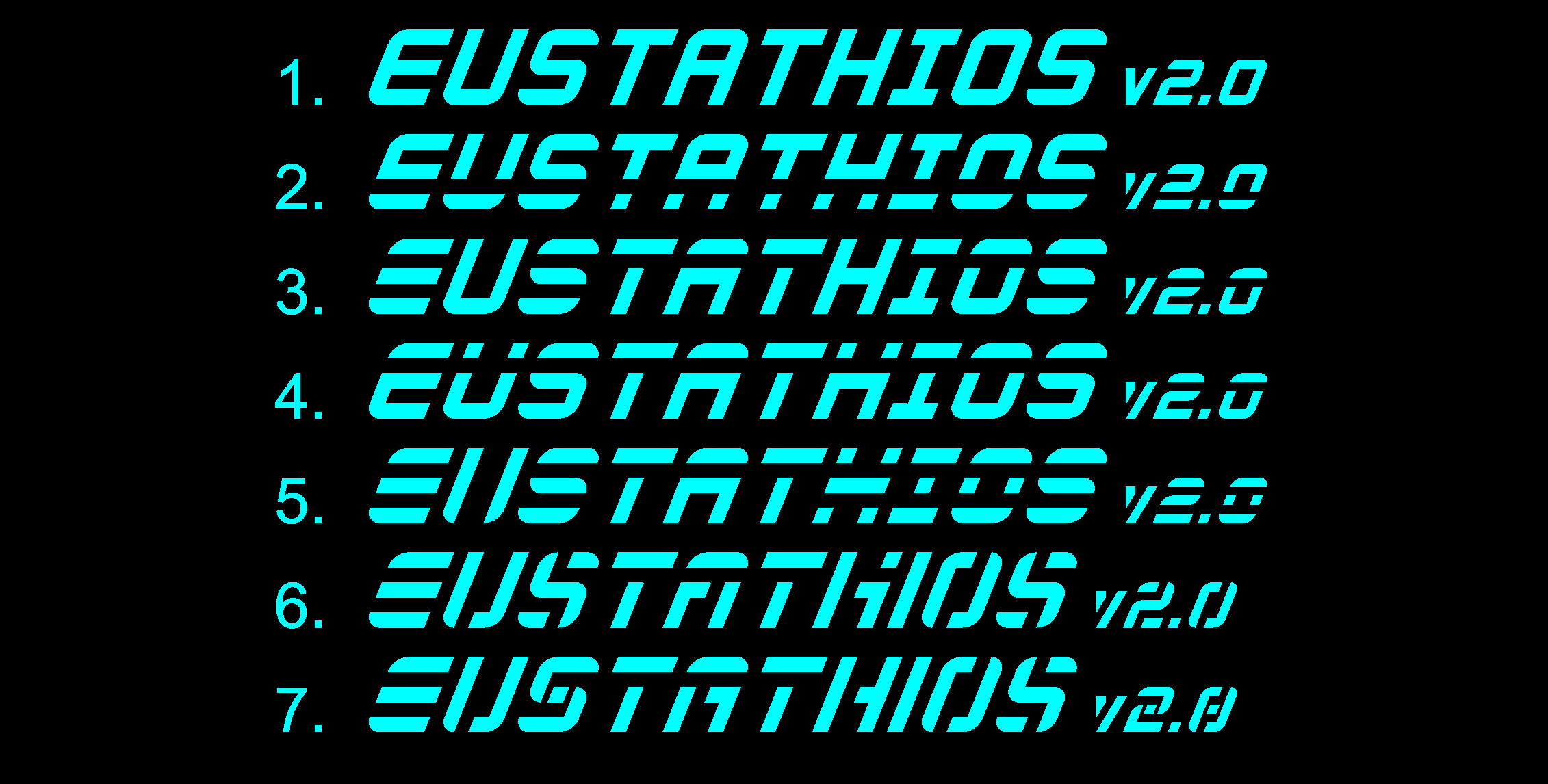
1 represents a the base text I would be working from. Each letter was drawn on a 5x4 skewed grid (with the exception of the T, the vertical stroke of which had to be centered between the 2nd and 3rd columns), with curves added to the corners to accentuate the letters. While it’s pretty simple and nice on its own, the A and the O have enclosed regions, creating issues when it comes to laser cutting. From here, I wanted to find interesting ways to create a sort of stylistic stencil typeface.
2 was accomplished by simply cutting all the letters at the 2nd row from the bottom. Unfortunately, this makes the letters all a bit top-heavy and the A retains an enclosed region.
3 is a sort of mix between 2 and 4. I split letters horizontally where I felt they made sense. It’s a bit more abstract (the S and E for instance)
4 is like 2, but split horizontally at the 2nd row from the top. This doesn’t leave any enclosed regions, but unfortunately it makes the U (and the H, though it no longer looks like an H) appear to have an umlaut. It also resembles the ESPN logo a bit too much in my opinion.
5 is a variation of all of the above. All are (failry generously) cut horizontally with the exception of the U to avoid the umlaut issue. The only problem here is the cut is now 2 columns wide, whereas all prior cuts were only a single row or column wide.
6 is actually one my original designs I sketched on paper before I turned to the computer. I abandoned attempting to maintain only horizontal cuts and just made cuts where I thought they should be. I can’t work without rules however, so in this case I wouldn’t allow any regions of negative space to be surrounded on 3 sides. (compare the previous As to the #6 A) I did this for consistency and to avoid some fragility in the laser-cut piece. I also removed the header and footer from the I to make things a bit more compact.
Number 7 is very similar to number 6 with a few letter changes. I changed the S around a bit with 2 half-width cuts at the center. I also took out a cut from the H and reversed the side of the vertical cut in the A.
Anyway, why am I asking a bunch of “makers” about their opinions on a graphic design project? Well, I’m going to be adding this to the design files of my Eustathios build, and I want something that people are happy with. I’m also not so certain about what I want either, and it’s always good to get some opinions. So let me know which version you like best, and even which letters in particular you like. Currently, i’m looking at number 6 with maybe the A and the H from 7.